
Read time: 11 minutes
Editors Note: This post was updated and revamped in June 2022 for better accuracy and comprehensiveness.
When it comes to creating a website, we do everything we can to ensure that it is fully accessible.
From alt-text on each image to creating light and dark modes, we make sure that every website is built with accessibility in mind.
We don’t do this with any sort of “plug-and-play” feature either, as every site is custom fit with accessibility features that make sense for their website, its functionality, and their business goals.
For many people, the benefit is clear:
Having an accessible website that anyone can use regardless of ability.
This is especially beneficial for website owners who have people with disabilities as a primary demographic, such as Centers for Independent Living (CILs).
And while many people focus on that, as well as having a fresh and clean website that better captures the business’s “essence,” there’s another benefit that many people may not think about:
SEO.
When you have an accessible website, not only do you ensure anyone can use your site, but you also increase the chances of people finding your site through search engines like Google and Bing.
How?
Although we can point to specific web accessible practices that help contribute to strong SEO, that would be a long list.
Instead, here are three consistent themes you’ll see among accessible and high ranking sites, as well as one action item you can do today, to ensure your site is not only accessible, but also helps with its discoverability.
It’s Easy-to-Use
Regardless of what industry you’re in or what customers you serve, it’s incredibly important to ensure that your website is easy-to-use.
Now, “easy-to-use” is often thrown around as a blanket statement for users, with little explanation of what it means.
When we say “easy-to-use,” not only do we talk about simple things like page load speed and proper navigation (more on that later), but we’re also talking about:
- Clearly defined web pages that explain its specific purpose of it.
- Properly written content that utilizes sensible structure and organization.
- Pages that offer options to “get what you need” and “learn more,” all on one page.
- Web pages that are optimized for mobile devices.
All of these factors play a big role in creating an easy-to-use experience for your users, as well as helping your site rank higher on SERPs (Search Engine Results Pages).
So, how exactly does an easy-to-use website rank well on Google?
The two metrics that Google and Bing pay attention to are the bounce rate and page dwell time, as these are general indicators of how long a user will stay on your site.
Bounce rate tells Google the percentage of users that leave your site after only viewing one page, while page dwell time lets Google know how long a user spends time on your website.
When you have a low bounce rate and high page dwell time, it’s likely that your website will rank higher on Google.
And what’s a way to move towards that goal?
By creating an easy-to-use site.
What You Can Do
What can you do today to make your site easier to use?
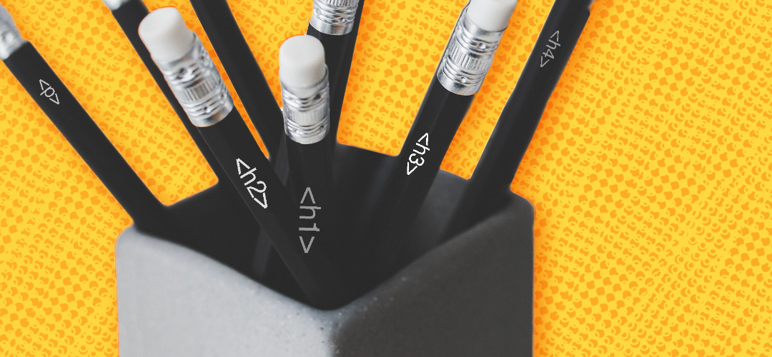
Ensure that all of your pages follow a proper content structure.
Whatever content you may have, make sure it follows this traditional H tag and P tag structure.
It would look something like this:
<H1>Title</H1>
<H2>Subheading</H2>
<H3>Subheading</h3>
<p>Paragraph</p>
Notice how there are “levels” to how this content is structured? This is how you want to set up any piece of content on your website. There isn’t a limited number of H tags either, so you can go as far down as H3 and H4.
Whatever is needed for your content.
Not only will this be easy to understand for users, but it serves as a natural progression for how your content can flow. Plus, this is also exceptionally helpful for those who rely on screen readers, as these tools read through content following this structure.
If you have your content out of order, that could negatively affect the experience of your users that do rely on screen readers. Not only does that hurt user’s perception of your website and brand, but it also negatively impacts your SEO.
So the next time you look through your site for improvements, make sure the first thing you check for is your content structure. It’s one of the easiest things you can do that can impact both web accessibility and SEO.
Your users will thank you, and Google may reward you.
Provide a Quality Experience

Websites that rank well on SERPs do so because they offer a quality experience for their users, but seldom is the user experience built with SEO in mind.
In fact, strong SEO is an unintended (but welcomed) result of a quality experience.
What makes a quality website experience?
It’s not as complex as you might think.
While many people believe a quality website experience involves all the “bells and whistles” such as video banner images and interactive maps, what many web users appreciate is simplicity.
Is your user able to find exactly what they need? Are they able to easily navigate through your website? If you house content, written or visual, are users easily able to navigate from one content piece to another?
Regardless of how fancy your website might be, that can all be forgotten if these core functionality pieces are missing or lacking on your website.
But along with everything mentioned, you need to keep accessibility in mind.
Does your site offer options to enlarge text for people with sight disabilities? Are users able to toggle between light and dark mode to better improve contrast? Can users fully rely on just a keyboard to navigate your site easily?
These small things are critical to creating a quality experience for your users and ensuring they feel empowered on your website. And these features are not only for people with disabilities, as able-bodied users are just as likely to use and benefit from these very same web-accessible practices.
Although it’s important to inject a bit of your business's personality into the website, it’s just as important that you don’t do it at the expense of a quality user experience in both general functionality and web accessibility.
What You Can Do
A lot of the things we just mentioned — proper navigation, video banner images, toggling light and dark mode, etc. — take time and some back-end knowledge to implement properly and with accessibility in mind.
But one thing you can do is write alt-text on all of your photos.
Similar to captions, alt-text allows people who rely on screen readers to properly understand the photo and its context to the content.
A couple of key things to note about alt-text:
- Make sure you keep it to 125 characters or less
- Don’t write alt-text for purely decorative photos
- Don’t start alt-text with “A photo of…” or “An image of…”
- Don’t “keyword stuff” your alt-text
Notice that last piece of advice?
Search engines actually take into account the alt-text you write for your photos, and they can have a positive impact on your website’s SEO. But, as we mentioned, avoid keyword stuffing and focus on describing the photo with as much detail as possible.
Keyword stuffing has become a pretty dated and frowned upon method for improving your SEO, and that’s no different with alt-text.
Finding Info Quickly

Whenever people land on your website, whether it’s on a blog page or on the home page, they should be able to quickly understand the structure of the site.
Although it is important that your site is tailored to the uniqueities of your business, it’s still important to maintain industry-standard practices on the site. From main and secondary navigation to the logo serving as the “return home” button, users should be able to understand all of this fairly quickly.
You want to make sure that your site allows users to quickly find what they are looking for. Although it’s great to have users scroll and click through your website, that shouldn’t be their only option.
This is also why bounce rate isn’t always the “end all, be all” of your website.
Many users visit a site with a specific goal in mind. If your site is able to provide that to them in one or two clicks, that’s a great sign of usability, but it can negatively affect your bounce rate.
Instead, focus more on other metrics that better indicate how people are enjoying your website.
How many pages on the website do they visit per session? How long are they “dwelling” on certain pieces of content? How many returning visitors are you getting?
These metrics, while representing only a few of the many metrics you can evaluate, provide a stronger picture of how people are navigating your website and enjoying your content.
What You Can Do
Evaluate the hyperlinks within your content.
One of the most frustrating things any website user can experience is vague hyperlinked text.
You know the ones we’re talking about:
- “Click here”
- “Learn more”
- “Get started”
Not only are these examples not helpful, but they can have a big negative impact on the experience of your website, which can impact your SEO.
How?
Although it is helpful to have outbound links to reputable resources within your site, especially if it’s related to the specific topic your discussing within the content, they won’t be as effective if people aren’t actually clicking on them.
With people growing increasingly distrusting of clicking links due to potential security risks, it’s important that you are briefly explaining the purpose of the link.
For example, let’s say we are talking about using carousels on a website.
“This is why carousels are not good for your website.”
Pretty vague, right? Additionally, it’s pretty clickbaity.
It doesn’t give the reader any indication of why carousels aren’t great for websites and, instead, forces the reader to click on the link to gather more context. That leads to a poor user experience and even losing website visitors, as they’ll be forced to leave your site for other information.
Here’s a better example:
“In fact, a study done by Eric Runyon, Director of Web Communications at the University of Notre Dame, shows that only 1.07% of users interacted with carousel content, with 89.1% of engagement happening on the first slide.”
Along with strong supporting text leading up to the hyperlink, notice how the hyperlinked text also explains the exact purpose of the outgoing link?
Although people are free to click through and learn more about it, they also get a clearer idea of what that particular link will be about. They now have a greater context of what the link will be about and can choose to disregard it and stay on your page since they understand how that link supports the greater content.
This also makes it easier for people who rely on screen readers for the same reasons, as they won’t have the additional burden of clicking away from your web page and navigating something completely new, which is both time-consuming and frustrating.
Bonus Tip
Now, this isn’t something that you’ll be able to implement today (unless you have some coding skills), but it is something we recommend you implement.
Especially if you have a deep website filled with various articles and products.
We’re talking about breadcrumbs.
Breadcrumbs not only allow your users to understand their own journey through your site, but it also allows them to easily “retrace their steps” without having to rely on the back button.
Notice the image below:

See how Best Buy gives users a clear understanding of where they would need to go to find “Chromebooks?”
Although Best Buy gives you options to find certain products right from the homepage, it will always give you a breadcrumb trail to understand how you would get there if you had to click through the site.
So if you ever want to look at different laptops or even find tablets, all you need to do is follow the breadcrumb trail.
Convenient, right?
From an accessibility standpoint, this is a fantastic feature for those that rely on keyboard navigation. Now instead of having to rely on the back button or toggle through the different options on the navigation bar, keyboard users can simply toggle through the breadcrumb options.
And when your website is convenient for all users, you can imagine how Google will react to that.
Although our web-accessible practices are beneficial to SEO, we are by no means SEO experts.
If you’re looking to learn more about SEO, we highly recommend the brilliant minds at Search Engine Journal. These experts are constantly providing new content to help you understand what’s going on in the world of SEO.
And if you’re looking to better understand web accessibility’s impact on SEO, we highly recommend this article: How and Why Accessibility Matters for SEO.
It’s well worth the read.
And if you’re looking to learn more about web accessibility, come check out our blog! It’s filled with tips and tricks — for beginners and seasoned pros — that’ll help make your web more accessible.